I don’t usually design logos; I’m a web developer and not so much a graphic designer. But, I had so much fun designing a new logo for DisableMyCable.com that I wanted to share my thought process and experience with you.
I started DisableMyCable.com to help people find free and cheap alternatives to cable TV.
The Original Logo
When my site achieved some significant popularity, I felt it was time to get a real, professionally-designed logo for it. The original logo was one that I simply made in Microsoft Word:
For the longest time, I had it on my “to do” list hire a designer to create a new logo. I did eventually make a spec for it, but I never did find a designer. So, I figured I’d give it a try myself.
My first sketch was this rather ambitious retro-inspired design:
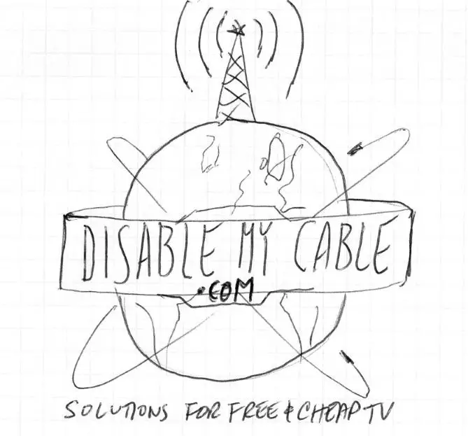
In retrospect, this was too complicated and busy. I realized that and gave up for a few months.
The New Logo Evolution
Then one day, I started playing with Google Fonts and found one called “Audiowide”. I typed in “DisableMyCable” and got this look:
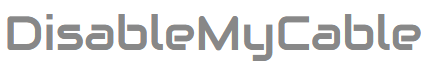
I kinda liked it. It was more futuristic than my existing logo. And, the letters themselves kinda looked like they were made of bent pieces of cable! (Do you see it?)
I then experimented with colors. I ended up with a three-color design: orange, lime, and bright blue, which was designed to be analagous to the colors used on a TV screen: red, green, and blue, in the same order:
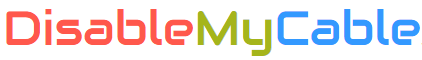
The colors also alluded to the “modular” nature of connecting different blocks together to make something that my site was about. The colors are reminiscent of the colors of children’s blocks. I liked the sense of simplicity and ease-of-use that conveyed.
But, the words were undeniably difficult to read, even when they were different colors. I solved that problem by filling in some of the gaps in the font (in the “a”s and “e”s for example). That made it much more readable.
This was good, but I also wanted some graphical indication of what the site was about. The bottom of the “y” in “my” spoke to me, and that became a coax cable pointing back at the user. The rest of the “y” became a flat antenna receiving a signal from the sky. Thus my logo was born!
The Finished Logo
I’m happy with how it turned out. I’m not saying that you should always design your own logo. In fact, for a “real” business, you should probably hire a professional. But why not have a little fun first and give it a try? At the very least, it can be a starting point when you do hire a professional designer.
I definitely think this new logo is lot more modern and eye-catching than the old one, and I saved a chunk of change! – Brian
